The 2016 Formula 1 season marked a visually refreshed grid after the winter break, with teams unveiling their latest liveries in Melbourne. The color palette of the grid became noticeably more vibrant, moving away from the predominantly dark tones of previous years. This article provides an in-depth review of all the 2016 Formula 1 liveries, with a special focus on the F1 Mercedes Livery 2016, analyzing its design elements, strengths, and areas for potential improvement.
Ferrari
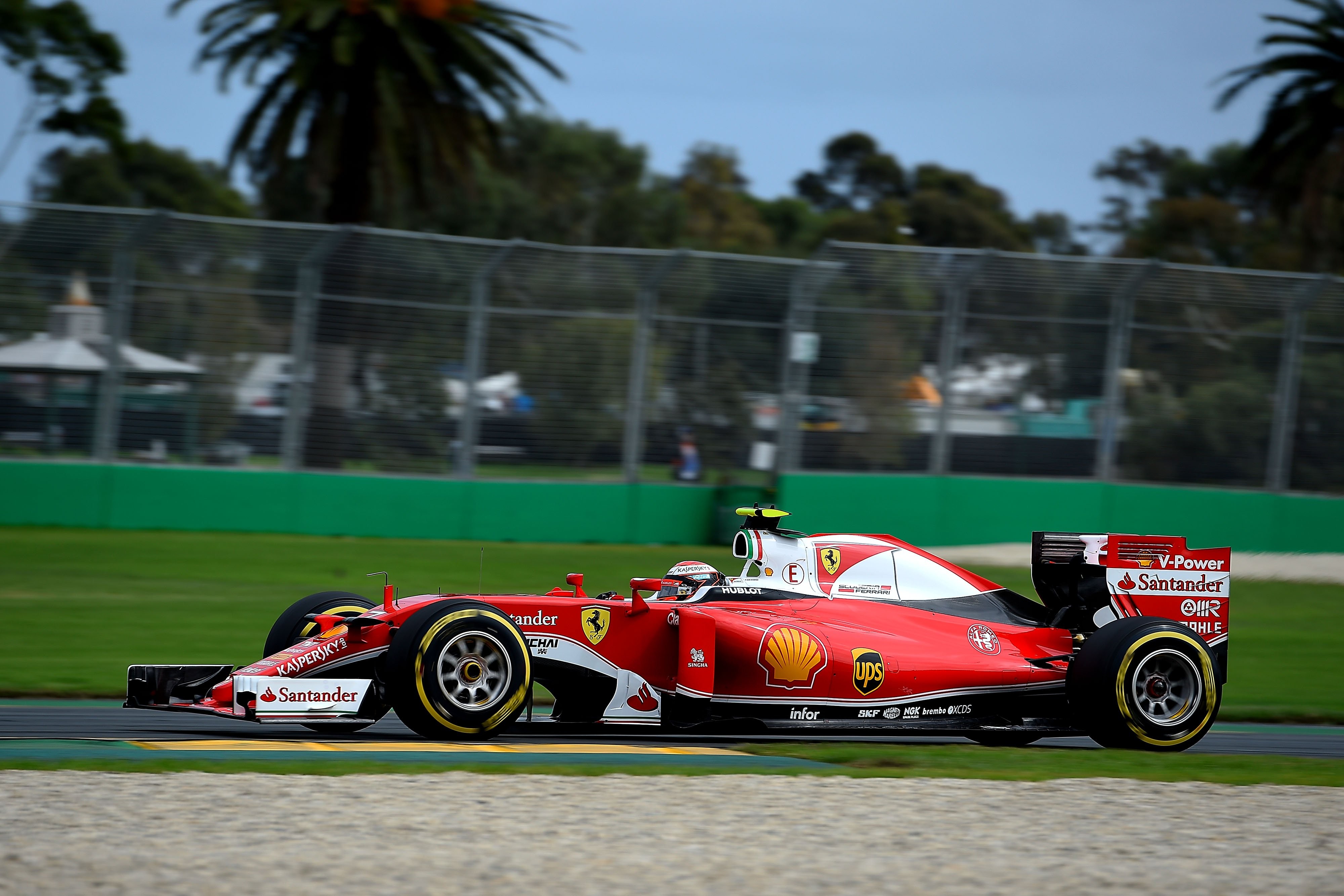
Alt text: Side profile of the Ferrari SF16-H Formula 1 car showcasing the white accents on the red livery for the 2016 season.
Ferrari introduced a significant update to their classic red livery by incorporating white elements, a noticeable departure from their recent designs. This change was largely well-received, adding a fresh dimension to the iconic Ferrari red. The white accents provided a welcome contrast and highlighted key areas of the car. While the addition of white was generally positive, some design elements felt slightly disjointed. The pinstripe along the lower side of the car and the wavy black section on the engine cover were noted as potentially clashing elements, disrupting the overall flow of the design.
Alt text: Front three-quarter view of the 2016 Ferrari F1 car, emphasizing the Italian flag stripes and the red and white split on the wings.
The inclusion of the Italian flag stripes in red, white, and green on the front wing endplates, airbox, and barge boards was a commendable touch, celebrating Ferrari’s heritage. However, the critique of clashing design elements persisted, suggesting that while individually appealing, the sum of the parts lacked complete visual harmony. Despite these minor criticisms, the 2016 Ferrari livery was considered visually engaging and a positive step forward for the team, largely due to the impactful white additions and the overall striking presence on the track.
Alt text: Artist’s rendering of a modified Ferrari 2016 livery concept, removing the pinstripe and extending the white section on the engine cover for a cleaner design.
A proposed refinement of the Ferrari livery focused on streamlining the design by removing the lower pinstripe and extending the white area on the engine cover. This suggested modification aimed to create a cleaner and more cohesive aesthetic without fundamentally altering the core design language of the updated livery.
Force India
Alt text: Side view of the Force India VJM09 Formula 1 car, highlighting the dark silver and black livery, considered underwhelming for the 2016 season.
Force India’s decision to maintain their 2015 livery was met with disappointment. The combination of black and silver, while potentially sophisticated, resulted in a livery that was perceived as dull and lacking visual impact. In a field of increasingly vibrant designs, the Force India livery struggled to stand out. Dark liveries can be highly effective, but this iteration failed to capture attention or create a memorable visual identity for the team.
Alt text: Front angle of the Force India 2016 F1 car, showing the limited visibility of silver elements against the black background and track surface.
The specific shade of silver used further contributed to the livery’s understated appearance. Its lack of brightness and tendency to blend with the surrounding black or tarmac diminished its visual presence. The small orange and green accents were acknowledged as positive elements, but they were insufficient to elevate the overall impact of the livery. The design execution of the green and orange stripes was also questioned, suggesting inconsistencies in their application and integration with the silver sections. Ultimately, the 2016 Force India livery was considered uninspired and a missed opportunity to create a more visually striking presence on the grid.
Haas
Alt text: Side profile of the Haas VF-16 Formula 1 car, showcasing the white replacing silver for a brighter and more impactful livery in their debut season.
Haas F1 Team, entering Formula 1 for the first time in 2016, made positive adjustments to their initial livery by replacing silver with white. This change significantly improved the visual appeal of the car, preventing it from appearing dull, a pitfall that Force India arguably experienced. The white base color introduced brightness and provided a strong contrast against the black and grey elements, effectively highlighting the red accents.
Alt text: Front perspective of the 2016 Haas F1 car, emphasizing the horizontal lines and the red accents on the endplates and nose.
The horizontal line design along the side of the car, sweeping upwards to meet the black section, was praised for its dynamic and cohesive execution. This design element effectively separated the white upper section from the lower parts of the car. While the red line on the rear was initially less favored, it became more accepted over time, although its termination point was still considered somewhat abrupt. The front of the livery was identified as the weakest area, particularly the grey section on the nose, which was deemed too narrow. Expanding the grey section across the entire nose width was suggested as an improvement. Despite these minor critiques, the Haas livery was generally well-received, especially the red endplates and the Haas logo’s enhanced visibility against the white background.
Alt text: Conceptual redesign of the Haas 2016 livery, focusing on sharpening the red line at the rear and refining the front nose design for improved aesthetics.
Proposed improvements for the Haas livery included refining the red line on the rear for a sharper finish and re-imagining the front design for a more integrated and impactful appearance. These minor tweaks aimed to further enhance an already strong and visually appealing debut livery.
Manor
Alt text: Side view of the Manor MRT05 Formula 1 car, showcasing the return of orange and blue to the grid, though considered a basic livery design.
Manor Racing’s 2016 livery was met with positive initial reactions, largely driven by the welcome return of orange and blue to the Formula 1 grid. The introduction of color was seen as a refreshing change, particularly the combination of orange, blue, and white, a color scheme with inherent appeal. However, beyond the novelty of the colors, the livery was considered simplistic and somewhat lacking in design depth. The overall impression was that the car looked rather empty, suggesting a need for more sponsors or more intricate design elements to fill the visual space.
Alt text: Three-quarter rear view of the 2016 Manor F1 car, highlighting the color combination of orange, blue, and black, and the subtle Manor logo on the engine cover.
The specific shades of orange and blue used were questioned in terms of their harmoniousness. While orange and blue are often a successful pairing, the particular tones chosen for the Manor livery were considered less than ideal in combination. The black element in the livery was identified as a potential detractor, suggesting that removing black from the main body of the car might improve the color balance. Conversely, the black section behind the driver’s head was praised. The placement of the Manor logo, subtly integrated into the engine cover in a darker shade of orange, was also seen as somewhat peculiar and potentially better executed in a lighter, more contrasting orange. Despite bringing much-needed color to the grid, the 2016 Manor livery was ultimately deemed less effective and visually appealing than its 2015 predecessor.
Alt text: Artist’s concept of a revised Manor 2016 livery, removing black, extending orange and blue, and adding piping details for a cleaner, more vibrant look.
A proposed redesign for the Manor livery involved eliminating black from the rear of the car and extending the orange and blue color fields to the exhaust area. Piping details were added behind the driver’s head and airbox, filling in previously black sections. The Manor logo on the engine cover was changed to a lighter shade of orange, and a logo was added to the sidepod to address the perceived emptiness. This revised concept aimed for a cleaner, less cluttered design with improved color coordination and a more substantial visual presence.
McLaren
Alt text: Side view of the McLaren MP4-31 Formula 1 car, featuring a charcoal grey livery with sponsors filling in design gaps, creating a less boring appearance.
McLaren opted for a relatively plain livery in 2016, but unlike Manor, it avoided looking empty. Strategic sponsor placements effectively filled in the visual gaps, compensating for the lack of elaborate design elements and contributing to a less monotonous appearance. The charcoal grey base color, while not particularly exciting, was considered inoffensive and within an acceptable aesthetic range. The removal of the nose stripes from previous years and the addition of red accents on the sidepods and engine cover were seen as positive changes. However, the continued use of faux-3D borders was noted as a less desirable element.
Alt text: Front view of the 2016 McLaren F1 car, highlighting the uniform design but criticizing the warped number on the nose for its awkward appearance.
The most commendable aspect of the McLaren livery was its uniformity. This consistent approach to design was seen as a significant strength. However, a notable point of criticism was the distorted number on the nose, warped outwards at the top. This design choice was perceived as awkward and ill-conceived, appearing strange even from a direct front view and detracting from the otherwise clean and uniform aesthetic.
Mercedes
Alt text: Side profile of the Mercedes W07 Formula 1 car, emphasizing the turquoise design elements and the extensive use of black in the 2016 livery.
The F1 Mercedes livery 2016, while retaining its core silver and black identity, incorporated more turquoise than previous iterations, fulfilling part of the pre-season promises of a visually lighter design. However, the extensive use of black remained a dominant feature, which, in the reviewer’s opinion, detracted from the overall potential of the livery. The turquoise design element on the sidepods was acknowledged as aesthetically pleasing, but its execution was criticized for fading into the black at the bottom, lacking a crisp and defined termination. The shadow bordering the turquoise section was also considered unnecessary and visually cumbersome. Similarly, the smoky black finish on the engine cover was not favored, contributing to the perception of the livery being heavier and darker than desired. For fans specifically searching for “f1 mercedes livery 2016“, these details are crucial in understanding the nuances of the design.
Alt text: Front three-quarter view of the 2016 Mercedes Formula 1 car, showing the turquoise lines near the cockpit and the full turquoise rear wing, contrasted with black elements.
The thin turquoise lines at the front of the cockpit and the full turquoise rear wing were highlighted as positive design features, adding welcome splashes of color. The black endplates were deemed acceptable, but the overarching sentiment was that the livery would have benefited significantly from a reduction in the overall amount of black. While some black is arguably necessary to provide a background for the silver Mercedes logo on the engine cover, its pervasive presence across the car was deemed excessive. Many enthusiasts of f1 mercedes livery 2016 and Mercedes-Benz motorsport history often point to the liveries from 2010-2013 as a benchmark of visually appealing “Silver Arrows” designs.
Alt text: Modified Mercedes 2016 livery concept, significantly reducing black shadow areas for a cleaner and brighter “Silver Arrows” aesthetic.
A proposed modification of the f1 mercedes livery 2016 involved removing substantial portions of the black shadow sections. This adjustment aimed to create a cleaner and less visually heavy design, aligning with a preference for “clean” liveries. This change also highlighted the surprisingly low number of prominent sponsor logos on the car, a fact effectively disguised by the existing design. Despite the limited sponsor visibility, the livery did not appear empty, showcasing the design team’s skill in creating a balanced visual composition. Ultimately, a return to a livery style reminiscent of the 2011-2013 era was suggested as a more aesthetically pleasing direction for the Mercedes team, or even a more radical design departure to fully refresh the “Silver Arrows” image.
Red Bull
Alt text: Side view of the Red Bull RB12 Formula 1 car, showcasing the matte navy blue livery and the bold, outline-free Red Bull logo, a standout design for 2016.
The Red Bull Racing livery for 2016 emerged as a strong favorite, possibly the most admired on the grid. The matte finish was considered a distinctive and appealing feature, and the deep navy blue base color was praised for its richness. A key design highlight was the Red Bull logo, presented without its usual outline. This bold change worked exceptionally well due to the use of a vibrant, almost fluorescent red, which created a striking contrast against the navy blue. The livery’s impact was noted to be even more pronounced in person, as observed at the Australian Grand Prix.
Alt text: Front angle of the 2016 Red Bull F1 car, emphasizing the simplicity of the design with Red Bull logos, a bull on the engine cover, and a thin red side stripe.
The simplicity of the Red Bull livery was a welcome departure from the more complex designs of previous years. The design primarily consisted of Red Bull logos, the iconic bull on the engine cover, and a subtle red stripe along the side of the car. This minimalist approach was highly effective, with very little deemed in need of alteration. The only suggested refinement was the removal of the yellow outline from the bull logo, considered unnecessary. Even the inclusion of Total’s red branding on the endplates was viewed as unobtrusive and well-integrated.
Renault
Alt text: Side view of the Renault RS16 Formula 1 car, displaying the full yellow livery with a matte finish, marking Renault’s return as a constructor in 2016.
Renault made a bold statement upon their return as a constructor in 2016 by adopting a predominantly yellow livery, as previewed during pre-season testing. Essentially an inversion of their testing livery’s colors, the race livery featured a vibrant yellow base with a matte finish. The chosen shade of yellow was highly praised, adding another strong splash of color to the grid. The matte finish was also well-received, creating a sophisticated look that, at certain angles, exhibited a pearlescent effect, a testament to the team’s attention to detail in paint application.
Alt text: Front three-quarter view of the 2016 Renault F1 car, highlighting the yellow livery and the subtle honeycomb pattern on the rear, though considered somewhat plain overall.
Despite the appealing yellow color, the Renault livery was considered somewhat lacking in design complexity compared to its testing counterpart. While the black design of the testing livery was seen as sleek and classy, the yellow race livery appeared a bit plain and devoid of intricate design elements. Subtle details, such as contrasting colors on the inner wing endplates, present in the testing livery, were absent in the race version. However, the honeycomb pattern on the rear of the car, rendered in a reflective gold color, was acknowledged as a sophisticated and intricate design detail.
Alt text: Close-up side view of the Renault 2016 F1 car, emphasizing the vibrant yellow color which compensates for the livery’s overall simplicity in design.
Ultimately, while the Renault livery was somewhat simplistic in its design execution, the impactful choice of yellow color was deemed sufficient to compensate for the lack of extensive design work, making it a visually striking and welcome addition to the grid.
Sauber
Alt text: Side profile of the Sauber C35 Formula 1 car, retaining the 2015 livery, considered underwhelming and generic in comparison to other 2016 designs.
Sauber, similar to Force India, opted to maintain their 2015 livery for the 2016 season. This decision resulted in a design that was largely considered underwhelming and uninspired, although acknowledging that opinions on livery aesthetics are subjective. The sidepod design, while simple, was criticized for the integration of white bordering around the yellow section. The blue and yellow combination itself was deemed strong, but the white interjection was seen as disruptive and unnecessary. The nose design suffered from a similar issue, with a parabolic section that clashed with the squared-off nose shape, considered a design flaw.
Alt text: Front angle of the 2016 Sauber F1 car, highlighting the cluttered rear wing endplates with multiple logos and the simplistic sidepod design.
The rear wing endplates were singled out as the weakest design element, overloaded with numerous logos and colors, reminiscent of less sophisticated liveries from the early 1990s. This cluttered approach was deemed aesthetically unappealing and conveying a sense of cheapness. Direct communication with Sauber regarding their livery design revealed that team colors are primarily blue and white, with yellow limited to the sidepod area due to sponsorship agreements with Banco do Brazil. Weight and cost constraints were also cited as factors influencing the simplicity of the design. While understanding the practical limitations and complexities behind livery design, a desire for a more adventurous or at least a more refined and elegant livery for Sauber persisted.
Alt text: Conceptual modification of the Sauber 2016 livery, removing white from sidepods, refining nose yellow, and adding white accents for a cleaner, team-color focused design.
A proposed revision of the Sauber livery focused on removing the white from the sidepods to enhance the blue and yellow contrast. The yellow on the nose was replaced with white to align with the team’s core colors. Additional small white accents were introduced in front of the cockpit, behind the driver’s head and airbox, and on the engine cover to add visual interest without adding excessive weight. These changes aimed to create a cleaner, more cohesive livery that better reflected Sauber’s team colors and addressed the perceived emptiness of the original design.
Toro Rosso
Alt text: Side view of the Toro Rosso STR11 Formula 1 car, featuring a busy livery with Red Bull branding, cola can image, and multiple design elements, considered messy.
Toro Rosso’s 2016 livery continued a trend of visually cluttered designs, failing to impress. The engine cover’s prominent bull graphic, the squashed Red Bull logo on the sidepods, the full-color Red Bull Cola can image, and the design ahead of the cockpit all contributed to an overly busy and disjointed appearance. The overall impression was a lack of uniformity and an excessive number of competing visual elements. Full-color product images, like the cola can, are generally discouraged in livery design due to their tendency to clash and look out of place.
Alt text: Front three-quarter view of the 2016 Toro Rosso F1 car, highlighting the navy blue base, gold accents, and the disharmonious color combination and front wing design.
The color combination of navy blue, red, white, and gold was also questioned. The specific shade of gold was deemed particularly dull and unappealing in this context. A chrome gold was suggested as a potentially better alternative, although concerns were raised that it might further contribute to a dull overall appearance if not balanced with brighter colors. The small design element in front of the cockpit was singled out as particularly incongruous and detrimental to the overall design, suggesting the livery would have been improved by its removal. It was hoped that the team’s improved on-track performance might attract new sponsors, potentially leading to a livery redesign in the future.
Alt text: Creative redesign of the Toro Rosso 2016 livery, removing gold, adding white, and incorporating red and white stripes for a more dynamic and cleaner appearance.
A more radical redesign was proposed for the Toro Rosso livery, taking significant liberties to create a more visually appealing concept. All gold elements were removed, notably from the nose area, which immediately improved the livery’s brightness. The presence of white was increased, and an interrupted red and white striped design was introduced along the side of the car. The Red Bull Simply Cola branding on the rear wing was changed from a can image to a logo, a more visually harmonious solution. While retaining the bull on the engine cover and the prominent Red Bull logo for realism, the overall redesign aimed for a cleaner, more dynamic, and less cluttered aesthetic.
Williams
Alt text: Side view of the Williams FW38 Formula 1 car, maintaining the Martini Racing livery for 2016, a classic design nearing potential over-familiarity.
Williams continued with their Martini Racing livery in 2016, a design that, while still highly regarded, was approaching a point of potential over-familiarity. Williams has a history of long-term livery consistency, often maintaining the same design throughout the duration of a major sponsorship. Historical examples include extended periods with largely unchanged Fly Saudia, Rothmans, Compaq/HP, and Cannon liveries. Based on this precedent, it was speculated that the Martini livery might remain for at least another year, contingent on sponsorship agreements.
Alt text: Front angle of the 2016 Williams F1 car, highlighting the sweeping Martini stripes, black endplates, and uniform sponsor logos contributing to a neat livery.
The Martini livery itself was praised for its elegant design, featuring sweeping Martini stripes originating from the nose supports, flowing along the nose sides, over the driver’s head supports, and culminating on the engine covers. This continuous design element was considered impressive and well-executed. The black endplates and the black lower section of the car were deemed excellent design choices. The uniform and well-integrated sponsor logos further contributed to the livery’s overall neat and polished appearance. Despite its enduring appeal, a slight evolution or refresh of the livery was suggested for the following year to maintain its freshness and visual interest.
Conclusion
The 2016 Formula 1 grid presented a diverse range of liveries, from visually striking and innovative designs to more conservative and less memorable schemes. While some teams opted for bold color palettes and dynamic graphics, others favored simpler or evolutionary approaches. Overall, the 2016 grid was considered a visual improvement compared to the previous year, offering a more vibrant and engaging spectacle for fans. However, as always, there remained opportunities for teams to further refine their livery designs and enhance their visual identity on the Formula 1 stage. The f1 mercedes livery 2016, while a solid design, exemplified this point, showcasing areas where subtle adjustments could have elevated it to an even higher level of aesthetic appeal.